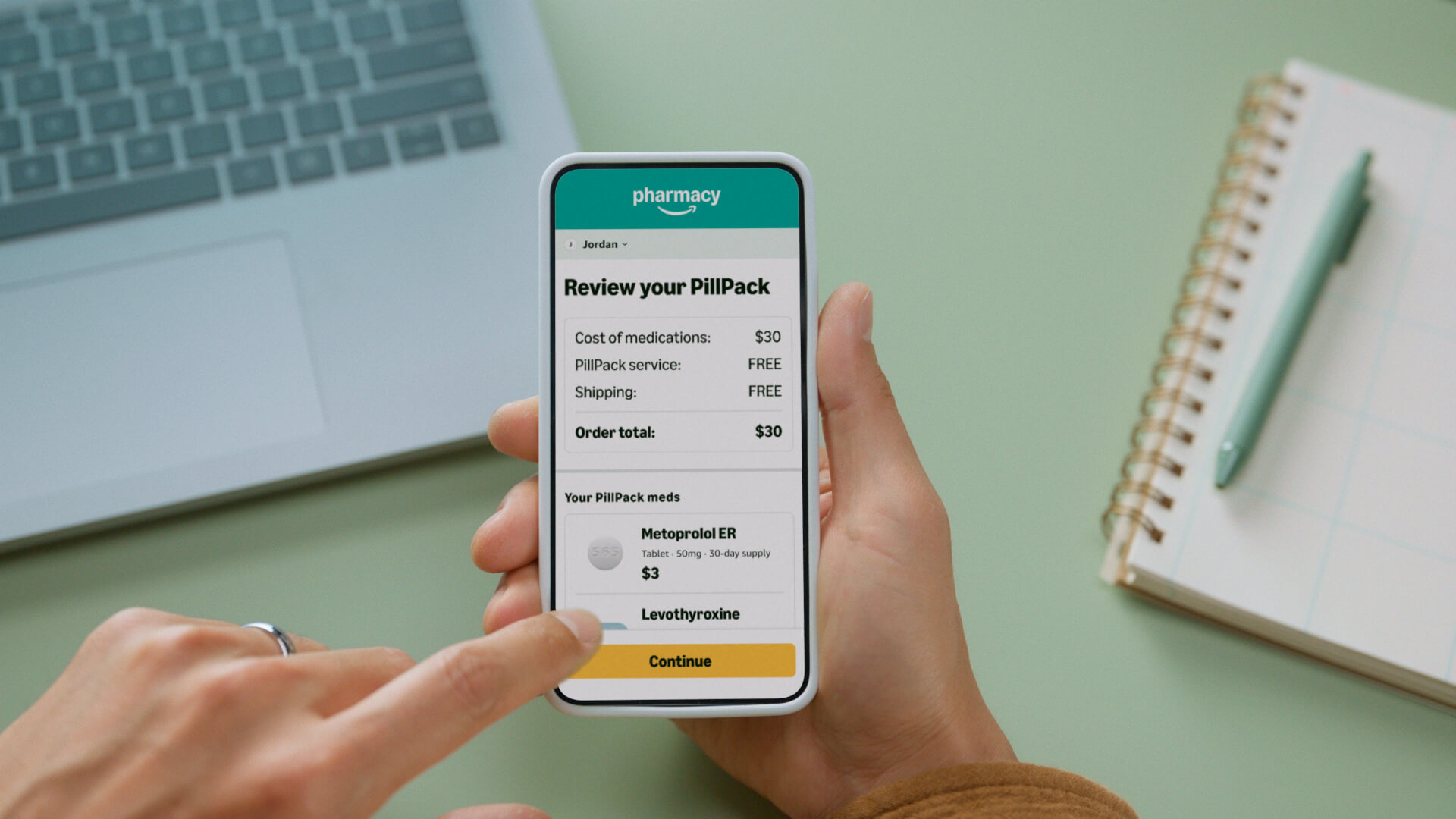
6 years after acquiring PillPack in 2018, Amazon Pharmacy finally brought the convenient medication sorting service into the Amazon experience. To introduce this service to Amazon customers, the brand team produced 2 landing pages, 1 live action brand video, 1 animated explainer video, a bunch of new photographic assets, and various other marketing materials.
Brand video
This is PillPack.
This video was created to introduce customers to PillPack on Amazon Pharmacy and highlight the pain points solved by the product. It was featured on the PillPack landing page and in the Amazon Blog post announcing the product launch.
After effects x Premiere Pro x DaVinci Resolve x Figma
Process
Pre-production
The original concept for this video was created by a copywriter and creative director— I provided inputs and used the rough storyboard to create an animatic with a scratch track that helped to illustrate the pacing and shots. The animatic also helped to set the vision with stakeholders and our production partners, and was even referenced on set while shooting. The animatic was also included in user testing to see if it helped customers understand what the PillPack service was. *Spoiler alert* it did!
Production
We partnered with a photographer and video production agency to execute a 2-day, combined photo and video shoot— all at one location. This allowed us to get a large amount of content in a short period of time. At the end of the shoot, all of the raw footage was handed off to me for post-production.
Post-production
After receiving the raw footage and recording the final voiceover, I owned all of the post-production including (but not limited to!): editing, animation, visual effects, color correction, and sound. We worked with a composer to create a custom music track to tie it all together.


Animated Explainer video
What is short-term supply?
After a customer enrolls in PillPack, all of their medication refill dates must be aligned so that all of the pills can arrive together. Depending on how many pills the customer has left, they may need to order a short-term supply so that they don’t run out before the new refill date. This animated video was created to introduce and explain this concept to customers in a fun and engaging way, it lives on the dedicated short-term supply landing page.
After effects x Premiere Pro x Cinema 4d x Illustrator
Process
Storyboarding x Look development
After working with a copywriter to get the script in a good spot, I created a rough storyboard—using simple line drawings to convey the overall layout and block out key animation moments. I used the storyboard to get stakeholder buy in on the animation and illustrations before spending a bunch of time on animation or design. This went through a few revisions as I collected relevant inputs from various teams including Product, Marketing, UX, and Ops.
At this stage I also made a few rough test animations to see if they would work and to help stakeholders visualize what I was imagining.
Animatic
After the rough storyboard was in a good place, I recorded a scratch track voiceover and edited it together with the storyboard frames to get an idea of the overall pacing. This was also used as part of the landing page user testing prototype to see if it helped customers understand short-term supply. *Spoiler alert* it did!
Asset creation x Rigging
Once the script and storyboard were locked, I moved into asset creation and rigging. I illustrated all of the 2D assets in Adobe Illustrator and rigged them for animation in After Effects. I modeled, textured, and rigged all of the 3D assets in Cinema 4D— some of which I also rigged in Element 3D so that I could directly parent 3D assets to 2D within After Effects.
Animation x Sound
After the assets were created and prepped for animation and the voice over was recorded, it was time to start laying down keyframes! The majority of the animation was done inside of After Effects, with a few sequences done inside of Cinema 4D. After animation was complete, I cut a music track to fit and added additional sound effects in Premiere Pro.
Fun fact: I recorded all of the pill and bottle cap noises myself.
Landing page
Goodbye sorting meds. Hello PillPack.
To introduce customers to the PillPack on Amazon Pharmacy feature, I designed and built a custom landing page. I worked closely with the Product and UX teams to tailor the content and design to meet customer needs. I also implemented iterative improvements from data gathered from user testing studies.
Figma x Photoshop x Internal CMS
Landing page
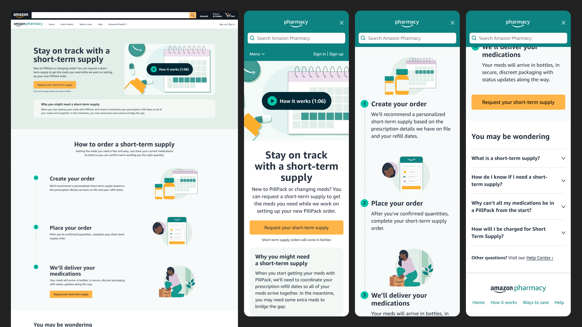
Stay on track with a short-term supply
When customers sign up for PillPack, there’s a good chance they may need to order a short-term supply of medications before their first full PillPack arrives. To help educate customers about this, a dedicated landing page was created.
I was responsible for both designing the page and building it in Amazon’s internal CMS tool.
